
Scuba Central: an immersive
e-commerce experience
This mockup is for a web experience for people to learn about Scuba diving and to purchase the necessary gear.
Role: Lead designer.
Timeline: 3 weeks
Context: Coursework
Motivation: I designed this unique e-commerce website to instill wonder in an otherwise standardized experience of buying items online.
I began by creating a site map to understand the navigation and feature set. Then, I created wireframes. After, I created the visual design in high-fidelity mockups.
Tools: Figma, Adobe Photoshop, Adobe Illustrator
User walkthrough.
From landing on the page, users will be able to divert down the three initial paths. The three paths are the History of Scuba Diving , Build your Gear Kit, and Identify Common Animals.
Users can apply a set of filters to help add or subtract different gear to the diver model. Users can add or subtract gear in general, or, add or subtract gear based on different criteria like water temperature and depth of the dive. These features can be accessed essentially in parallel or simultaneously, which is why they are shown in the same ‘loop’ of the user flow.
After adding and subtracting gear, users will find themselves at natural resting points, where they may wish to learn more about a specific part of their gear. At this point, users will see stats and information about their selection. For certain gear there is a lot of information such as the case for the tank gas mixture or the dive gauge/computer.
However, I recognize that users may always wish to reset to a different known state, or to remove the gear that they just added, so on this same page users can re-enter the loop of selecting gear based on different conditions by resetting.
Once the user has explored the different gear arrangements to their content, they can progress out of this part of the site. Next, users can safety test their gear by simulating different depths, conditions, and even a shark attack!
They have a few options other than closing the site or seeing different webpages. For example, the user can send a link to a friend with the current diver buildout so that when the friend clicks a link, he or she will see exactly what the sender was looking at and can customize from there. Additionally, users can purchase the gear shown on the diver model for themselves and the site will redirect them to trusted gear sellers in their area.
Paper sketching
I find it useful to sketch my ideas quickly and roughly on paper before I open up my prototyping tool and doing some wireframes.
I draw all of my main screens and work out the most important aspects such as the user flow, main navigation, and important UI elements.

Wireframing
The next step was to turn my paper sketches into low-fidelity wireframes.
I focused on implementing my features and the build your gear kit flow.
Home screen.
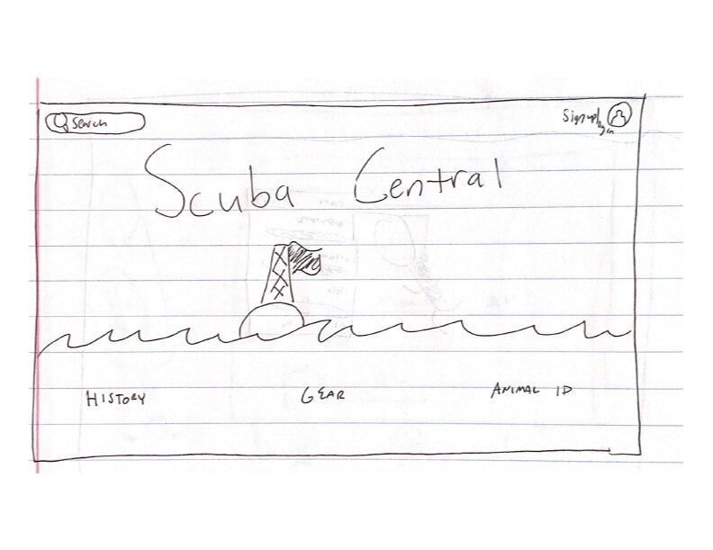
The home screen functions as a landing page for the website. At the bottom of the page there is the main horizontal navigation with the three concepts from the first email such as History (a timeline of Scuba history), Gear (which we have developed further), and Animal Identification (a way to identify common animals). To the right of the log in button is the user icon to further indicate that this website has additional features for users with accounts. From this icon, users can access those additional features. This top navigation will remain constant for the majority of the following screens.
Gear screen.
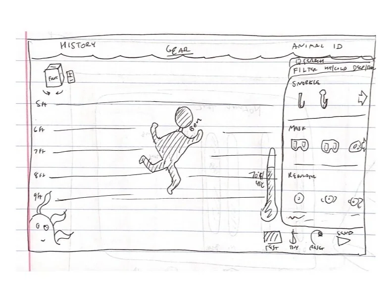
The gear screen is the main screen by which users will interact with the website. On the left side of the screen, users can see a scuba diver figure that gear can be added or subtracted from. This figure updates in real time as users add or subtract gear from the different categories on the right side of the screen. On the leftmost side of the screen, there are lines to show how deep down the diver model is because the depth of the dive directly influences the type of gear a diver needs, so by showing the diver figure in context of depth, users can begin to understand that important relationship. In addition to the lines, there are also depth labels in feet which will change to meters for users who are geo-tagged as accessing our website from a country that primarily uses the metric system. Users can click the little up or down arrows at the top and bottom of the left side of the screen to shift the depth of the diver and see how that influences the gear (through popping new gear on or off).
At the top left, there is a 3D cube with labels for each side that users can click and drag to see different angles of the diver figure. Users can click the different sides of the cube to have the ‘camera’/view face that side as though the diver were the cube. Users can also swivel around the diver using the curved arrows. Additionally, users can zoom in or out of the model with the + and - buttons. Lastly, users can reset the view cube to the default view by clicking the little home button. In case users have not used interfaces with similar 3D rotation cubes, at first there is a small popup that instructs users how to interact with the cube. On the right side of the screen is the gear browser. Here, users can add or subtract gear to and from the diver figure to see what it would look like on themselves as a diver and also to put the gear in context of the full gear set up for a dive. At the top of this gear browser users can search for specific gear types, brands, or models.
On the right side of the gear browser at the top, users can toggle to only show deep diving gear or only showing cold diving gear which will gray out options that are not applicable. Users can scroll over the gear browser to see gear that does not fit on the initial page. Selected gear that appears on the diver is outlined and has a check mark over the image of the gear. Each piece of gear has a short name as well as a short description and are divided by type of gear (i.e., masks, tanks, etc.).
At the bottom of this screen are the calls to action. Here, users can either reset the diver figure which will return his worn gear to a default state. Or, users can test the current gear kit in the test simulator to find the breaking points, or users can buy the gear that they selected, or the user can send the gear selected to a friend. The reset button is separate and located on the left side to represent taking a step backwards and to make it harder to accidentally press because it would be frustrating to accidentally uncheck everything. The other three options are on the right side because they represent progress and steps forward, so they are all grouped together on the right side to create that association.
Gear Screen (Grayed out).
This screen is the same as the previous screen except it represents what would happen when one of the toggles (in this case deep gear only) is active. The options that would be shallow gear are grayed out and the text is grayed out.
Gear Modal.
The gear modal pops up when users click on the image of gear on the diver figure. The background becomes grayed out and not selectable. However, if a user clicks on the grayed-out background then the modal closes. Additionally, if the user selects a new image of gear, then the modal will change to be about that piece of gear instead. The modal in this wireframe is for a scuba tank which has another screen associated with it if the user clicks ‘See More.’
This gear modal shows the name of the piece of gear and a short description of the piece of gear and some general characteristics. Below, there are labels for the information and a building bar chart to show the gas composition of the tank. Furthermore, there are percentage bars that will fill based on how much the current tank’s value in a certain aspect is compared to the maximum possible value. None of the information on the modal is editable, to edit that information, users will need to click ‘See More.
Scuba Tank Information Screen.
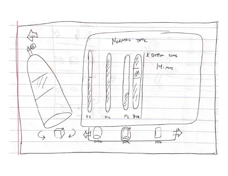
The user sees this screen when they click ‘See More’ on the tank modal. On this screen, users see the currently selected scuba tank on the left side. The user can rotate and zoom in on the tank in the same way as on the gear screens from before. On the top left, users can go back to the previous screen using the primary button. On the right side of the screen, users see the name of the currently selected tank as well as some of the same statistics about the tank as on the modal as well as some additional stats.
The user can also change the relative gas mixtures in the tank and the bottom time on the right-side changes based on the gas mixtures. When users change the relative gasses, the total tank stacked bars will also update so that users can see how all the gasses add to 100% full. On the right side of the screen users can enter in a custom bottom time or drag the number of minutes up or down and the website will indicate which gas mixtures will be needed to make the selected bottom time possible. At the bottom of the right side of the screen, users can select common premade gas mixtures such as air or nitrox, etc. Or, if users change parameters, then the program will set the gas mixture to custom. At the very bottom, users can select to see other tanks from the tank section which will have different stats and capabilities. If a user selects a different tank than the one they started with, when they click back, this new tank will be the one on their diver model.
Scuba Gauge Information Screen.
This screen is similar to the Scuba Tank Information Screen with the same controls to see and zoom in on different parts of the gauge. The right side of the screen has demonstration dials and gauges which would be displayed on the actual physical gauge. Each gauge is labeled and has a readout similar to the ones on the actual gauge. This gauge in particular shows the user the heading, depth, temperature, and bottom time. Some other gauges would show the user the tank air pressure, in which case that readout would appear on this screen. In addition, there are possible dangers of Scuba diving which this gauge readout would indicate. There is also a chart that shows the depth of the diver over time with notable events indicated with the circles. The user can click on each circle and a small modal would pop up and offer more information. This information is useful for the diver to see and plan the time between dives as well as how long each dive can safely occur. The user can click the + and - button to zoom in on the graph readout. Lastly, at the bottom, similarly to the previous screen, users can select different gauges or dive computers and this screen will update with the applicable information.
Send Diver Screen.
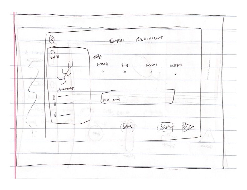
Once a user has selected and demoed all the gear he or she wants to, the user can select to send the diver. This action will send a link to the recipient of the user’s choice. The recipient will click a link which will bring them to Scuba Central where they land on the Build Your Gear Kit page with all the exact same pieces of gear loaded onto the diver figure. From there, the recipient can customize or change anything, but the starting point is the same as the sender’s stopping point. On the left side of the screen at the top, the user can click back to exit the sending flow. On the left as well there is the diver figure with the same orbit and rotate controls. At the bottom of that panel, the entire inventory loadout is visible. If there are too many pieces of gear to fit on the screen (as shown in this example), the rest of the gear list will be hidden. However, the user can hover the mouse over the inventory loadout card and it will pop up to reveal more of the gear list. If that is not enough, the user can click the up carrot button and the entire inventory loadout will pop up and fill more of the screen.
On the right side of the screen, the user can select one of the most common platforms to send the diver on such as by Email, SMS, Facebook, or Twitter. The common form pattern for selecting one of multiple options is clicked, then user enters the recipient’s information, then the diver link is sent. The send button has a send icon and is darker as that is the primary button and the one we would like the user to click. The two other options, ‘Buy’ and ‘Save’ are secondary so they are smaller and off to the side. Buy would take the user to the buy screen in which he or she would be redirected to common retailers. The Save button would save the current diver for later editing and requires an account.
Buy Gear Screen.
The Buy Gear Screen is a modal that pops up when the user clicks buy. This modal directs the user to select a location from which he or she would like to buy the gear that is currently on the diver. The top of the modal has instructions for what the user is supposed to do (select a retailer). Once the user has selected a retailer, they will be redirected to the retailer’s online store and the gear on the diver figure will already be in their cart for purchase. This screen is the way in which this website generates revenue. Through the use of affiliate/referral links, Scuba Central receives a small portion of each sale through its consolidation and redirecting of traffic to each of these sites. The user does not pay any additional money, but through our redirection of traffic to a retailer, we have generated revenue from these companies. This method of generating revenue is seamless to the user and also is a better and more interesting research method for the users. We have helped users understand the gear space and what they need for the type of diving they do and helped them locate the best and most trusted retailers.
The user is presented with four options on this modal. The first one, and the one that stands out the most, instructs users to enter their zip code so that they can be matched with local stores that sell the gear. This option has positive social messaging indicating that it is preferred to support local businesses. In the case that the local businesses will not work for whatever reason, there are buttons below logos for larger online retailers to direct users there.
Test Gear Screen.
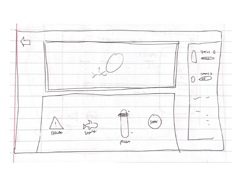
The user will see this screen when he or she clicks “Test.” This part of the website is more of a minigame than a serious reflection of the gear’s abilities. Here, users can push their selected gear to the absolute limit by subjecting the gear to immense pressure, or extreme temperatures. In addition, users can intentionally break certain gear components as well as subject the gear to a shark attack in which a ‘shark’ will randomly break or damage the gear to see how the whole system responds.
This screen mimics a lab environment because the diver and the gear are viewed through a ‘submarine’ or observation window. This submarine or observation window is represented with bolts to symbolize the industrial and utilitarian nature of these types of windows. In addition, the bottom part of the screen mimics a control panel with the different user-clickable buttons and sliders as well as fake indicator lights that might be present in an older lab environment. On the control panel, users can reset the test, pause the test, or play the test.
On the right side of the screen the user can monitor the status of the equipment through the readouts. There are the readouts that the gauge or dive computer would show such as the compass, depth, temperature, or bottom time. In addition, there are readouts for the common diving diseases which the diver might experience through increasing the pressure or high bottom times. These diseases will alert the user if the diver figure would be experiencing these conditions in a real-life situation so that users can better understand some of the dangers of diving. Lastly, there are three charts that show further status information such as the depth over time rather than a momentary depth readout because the user can dynamically change these values. In addition, there is a pressure readout over time for the same reason. The last gauge indicates the remaining gas in the tank because this value will lower with time as the test carries on.
Moodboards and Visual Direction.
I created three distinct moodboards to help provide visual direction for the website. Each one was different and would have led to an entirely unique online experience.
For the visual direction of Scuba Central, I decided to pursue the third moodboard, New Frontiers. This option was clearly the best option because it was the most unique and the most visually striking. As Scuba diving is such a wholistic and multi-modal experience, I wanted to choose the direction that had the most ‘wow’ factor. Users can immerse themselves in the interface following this moodboard. I thought about the experiences of being underwater and the ways that would impact the users, and I determined that this direction was the best option for the reason that it evokes multiple senses through just its imagery and presentation.
Efficient and mature.
This approach to the design direction focuses on the more mature and streamlined parts of Scuba diving. With its clean lines, similar color palette, and striking use of photos, this direction blends the real with the unreal parts of the Scuba experience. This direction highlights the elite and luxurious aspects of Scuba diving and minimizes the potential dangers, the exploration, and the turbidity of the ocean. Users of this website will appreciate that they can accomplish all of their goals quickly and efficiently, as the entire website is catered to their needs.
Fun and Light.
This approach focuses on the fun parts of Scuba diving and would position the site as more of a game catered to children. This approach would relax and spark joy for those with a fear of Scuba diving and effectively tear down the barriers to entry. There would be many photos of people enjoying the sport and illustrations capturing the wonders of the ocean in a flat and cartoon style.
New Frontiers.
This approach focuses primarily on the wonders of Scuba diving. It evokes the sound of the pinging of a submarine’s sonar echoing in the abyss. Things are slower moving and more catered to those with experience. The interface communicates wonder, with all of the parts of the ocean literally popping out of the screen. Users feel a sense of relaxation but power on this site. There are elements that communicate the three-dimensional aspects of Scuba as well as the actual creatures as they exist in the water.
High-fidelity mockups
Home screen.
This is the home screen that users will see when they go to ScubaCentral.com. They can click to see the history of Scuba diving, the Gear creator, and an Animal Identification page. We built out the gear creator.
GEAR SCREEN.
This is the gear screen that users will see when click on Gear on the home page. The left side of the page on the border shows the different types of gear that users can add to the diver model. The users can also search for different types of gear, filter for only deep or cold gear, and select different gear options. On the right, the diver model updates in real time. Users can click and drag the 3D view cube to see different angles. They can also adjust the depth of the diver or test, reset, buy, or send the gear.
GEAR SCREEN (GRAYED OUT).
This is the gear screen buy grayed out because the user filtered for deep gear only. There is an orange outline on the flippers because they are not rated to go to deep depths. The user can click on the outline or the warning sign and learn more about why the flippers are not compatible.
Gear Modal.
When users click on the gear on the diver model, a modal pops up which gives the name of the selected gear, a short description, some general information, and the option to see more information. In this case, the user clicked the tank, which from the current view, is behind the rest of the model. There is an onion skin ‘ghost image’ in front so the user can see clearly what he or she clicked on.
SCUBA TANK INFORMATION SCREEN.
When users click to see more information about the tank, they will see this screen. Here, the user can see more stats about the specific tank and manipulate the gas mixture in the tanks. The user can adjust certain gasses on the left side to see how it affects the bottom time on the right side, or the user can adjust the bottom time on the right side to see how the gases need to compensate. On the bottom, users can select from other tanks to see and add them to the diver model or to compare the tanks.
SCUBA GAUGE INFORMATION SCREEN.
When users click on the see more button on the gear modal of the diver model for the gauge, users see this screen. Similarly to the tank information screen, users can see some stats about the current gauge. This gauge, for example, has a compass, a depth gauge, a pressure reading, and a clock/timer. The sample readouts are shown on the left. Furthermore, based on those gauges, users can determine which of any possible dangers they have encountered at the sample depths their diver model is at, which is shown on the graph. Lastly, users can select to see other gauges by clicking from the carousel at the bottom.
SEND DIVER SCREEN.
Users can send their diver model with all the loaded gear to a friend. They can choose to send the diver through email, text message, twitter, or by copying the link. The user can also buy the gear directly from this page or save the diver model for later. The list of items in the inventory is on the right.
BUY GEAR SCREEN.
This page is for buying the gear. It allows the user to shop local or go to one of the main vendors for Scuba gear.
TEST GEAR SCREEN.
This is the gear test screen. Users can test a variety of situations with the gear. The left side shows the current gauge readouts and any notable events. The bottom part of the screen is the control panel to change situations. The right side shows the preview of the diver.


