
Adryft autonomous water taxi infotainment system ui
This is a conceptual UI for an infotainment system for a pretend new branch of Lyft called adryft for autonomous water taxis.
Role: Lead designer.
Timeline: 3 weeks.
Context: Coursework
Motivation: I designed this UI to help users control their autonomous water taxis while building trust and allowing new and returning users to understand the system.
I researched potential users and their goals, created moodboards, drew wireframes, created low-fidelity wireframes, then designed high-fidelity wireframes.
Tools: Figma, Adobe Photoshop, Adobe Illustrator, 3dsMax
features of the uI
Provide operational instructions and safety briefing
Verify the identity of the passenger
Highlight landmarks during transit
Display trip parameters (e.g., speed, real-time location, time left in trip, arrival time, etc.)
Enable destination changes
Real-time boat vision and camera views to let the user see what the boat sees
Declare an emergency, stop the boat, and contact support
Adjust display settings and volume
Play music from Spotify
Stream videos from popular platforms
Use Google Voice Assistant to interact with the boat
Adjust climate control
Fish finder
Moodboard.
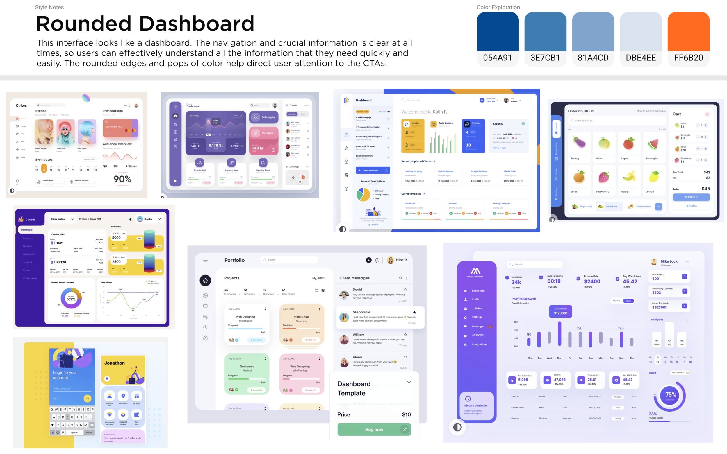
This is the moodboard that I used in the final design. It is both approachable and functional.
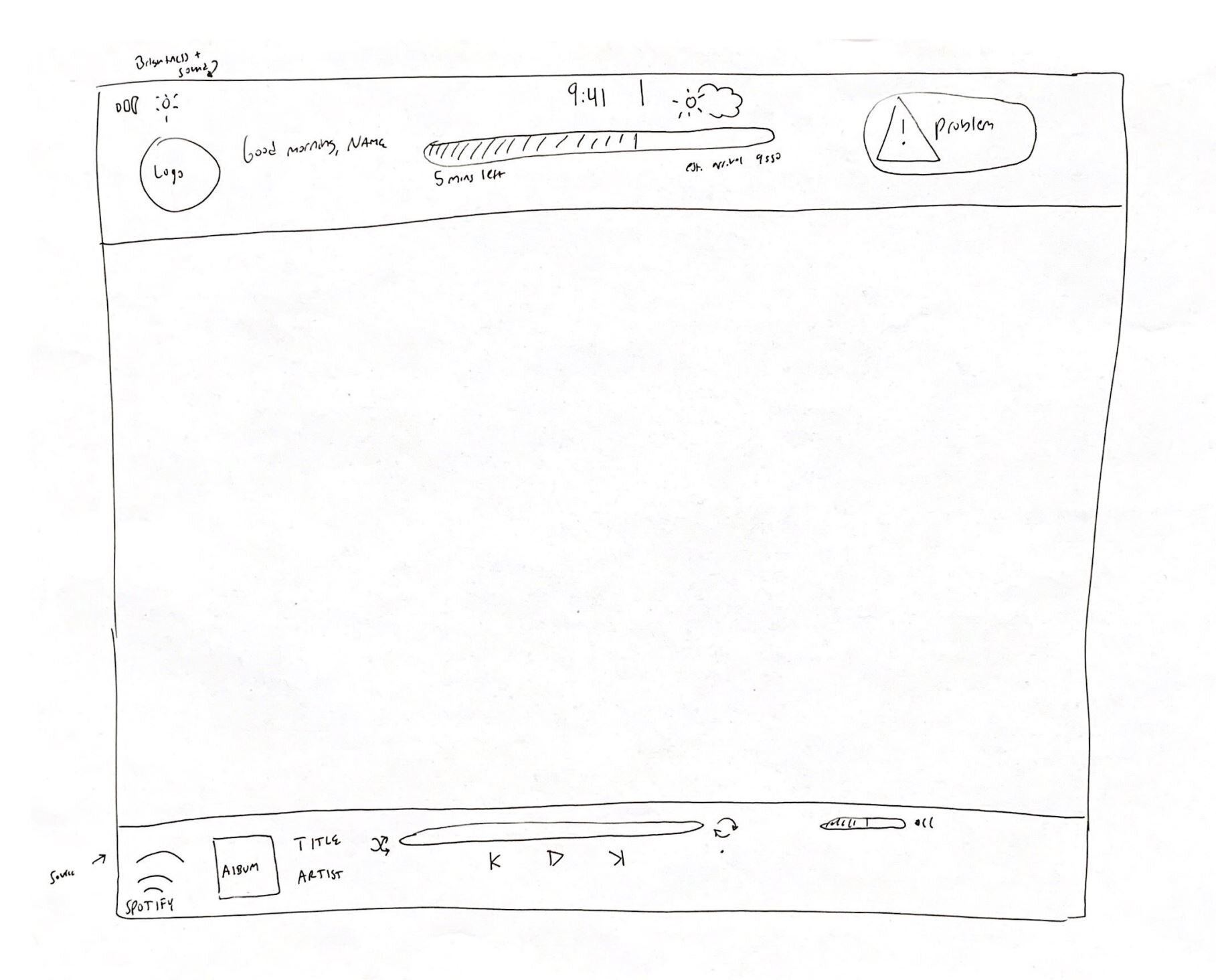
paper sketching
I wanted to make sure that each of my screens made sense. I find it quickest and fastest to sketch by hand first.
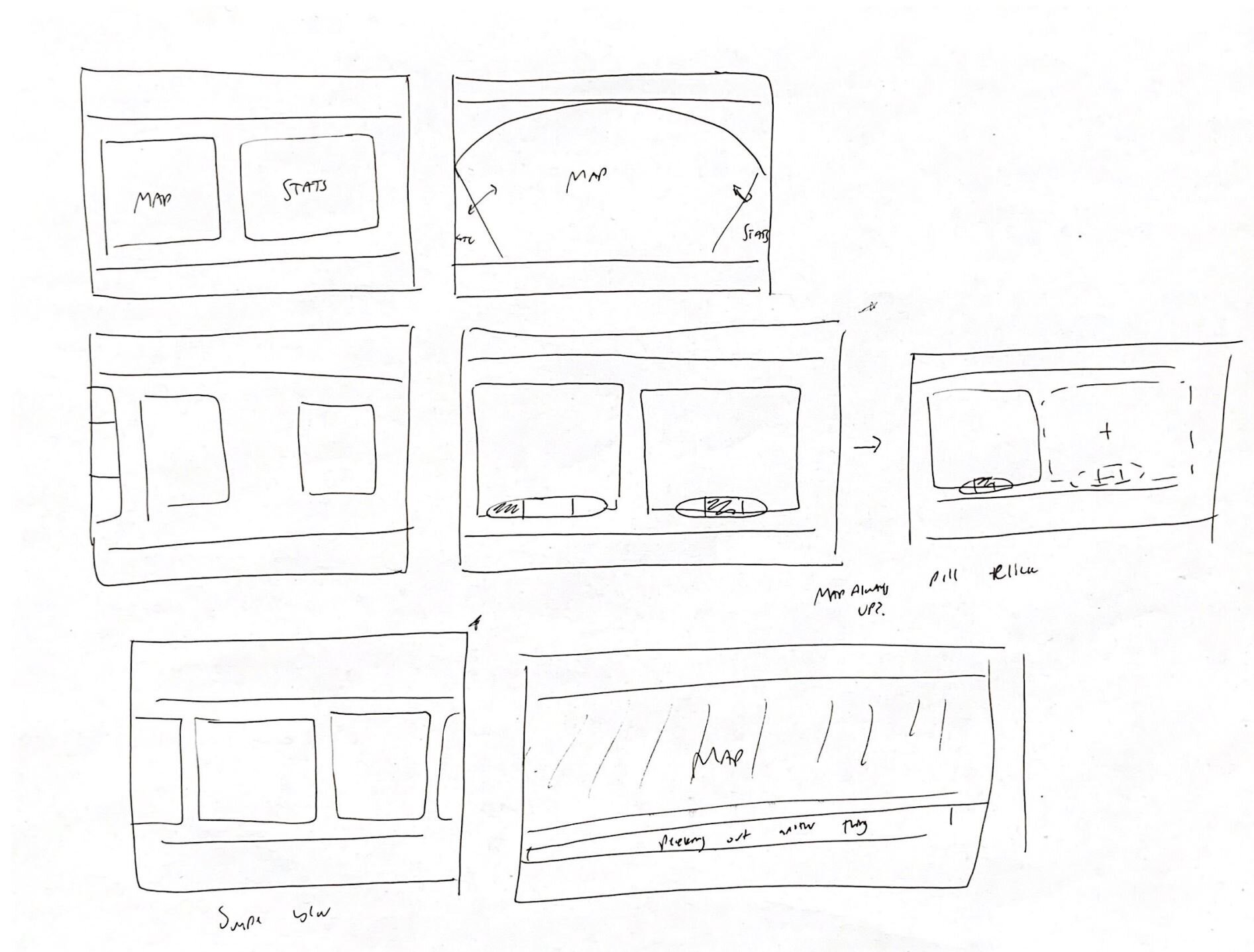
A lot changed between the wireframes and the final mockups. I simplified the navigation to make everything more clear.
low-fidelity wireframes
high-fidelity mockups
The design philosophy for this user interface was to create an application that was functional for both new and returning users. New users are interested in the most basic functionalities of the interface and are not likely to dive deeper into the UI. Returning users are likely to have already learned from their first voyage and may be more willing to find nested features. As a result, it was vital to ensure that most of the basic functionality is easily accessible and prominent. From my user research, I learned that trip progress and music are the two most important features of the application. As a result, those two parts are almost always visible and accessible across the different parts of the interface. Additionally, as this is an autonomous boat, users will be unfamiliar and likely distrustful of the concept. To compensate, I included an emergency button with three important options in an easily accessible way across most screens as well.
In addition, I simplified the user interface as much as possible. Every user-interactive button is color coded to the primary color of orange to stand out from the background and to accent the design. I wanted the map, which is a familiar design pattern across the Lyft app and its competitors to be the main screen and for the primary navigation to impose itself on top of that such that the map is always visible. In the quest to make the interface as simple as possible from the beginning, to minimize the need to learn the interface, I borrowed common patterns from successful designs from well-known companies. For example, I partnered with Spotify to integrate their music streaming platform into adryft. As such, I reconfigured, but rely heavily on, positive transfer of skills from the Spotify UI as it appears on desktop platforms for our interface. I make the most important parts of Spotify easily accessible in the interface (queue and popular music discovery). Additionally, I partnered with Google to create our maps. I borrow elements from Google Maps, such as their explore buttons, to help users understand their surroundings and add useful stops.
For our three additional screens beyond the map screen, I included only the most vital and fun functionality. I included boat information to gain user trust through increasing transparency. I show the user what the boat sees, such as the obstacle detection and lidar views. I also included common streaming platforms such as YouTube and Netflix in case users are bored on the trip. Lastly, I have comfort screens to adjust high-level parameters to make the ride more comfortable. While I could have chosen to include more detailed and granular controls, I understand that users are using these boats as transportation, and that level of control would overwhelm first time users.

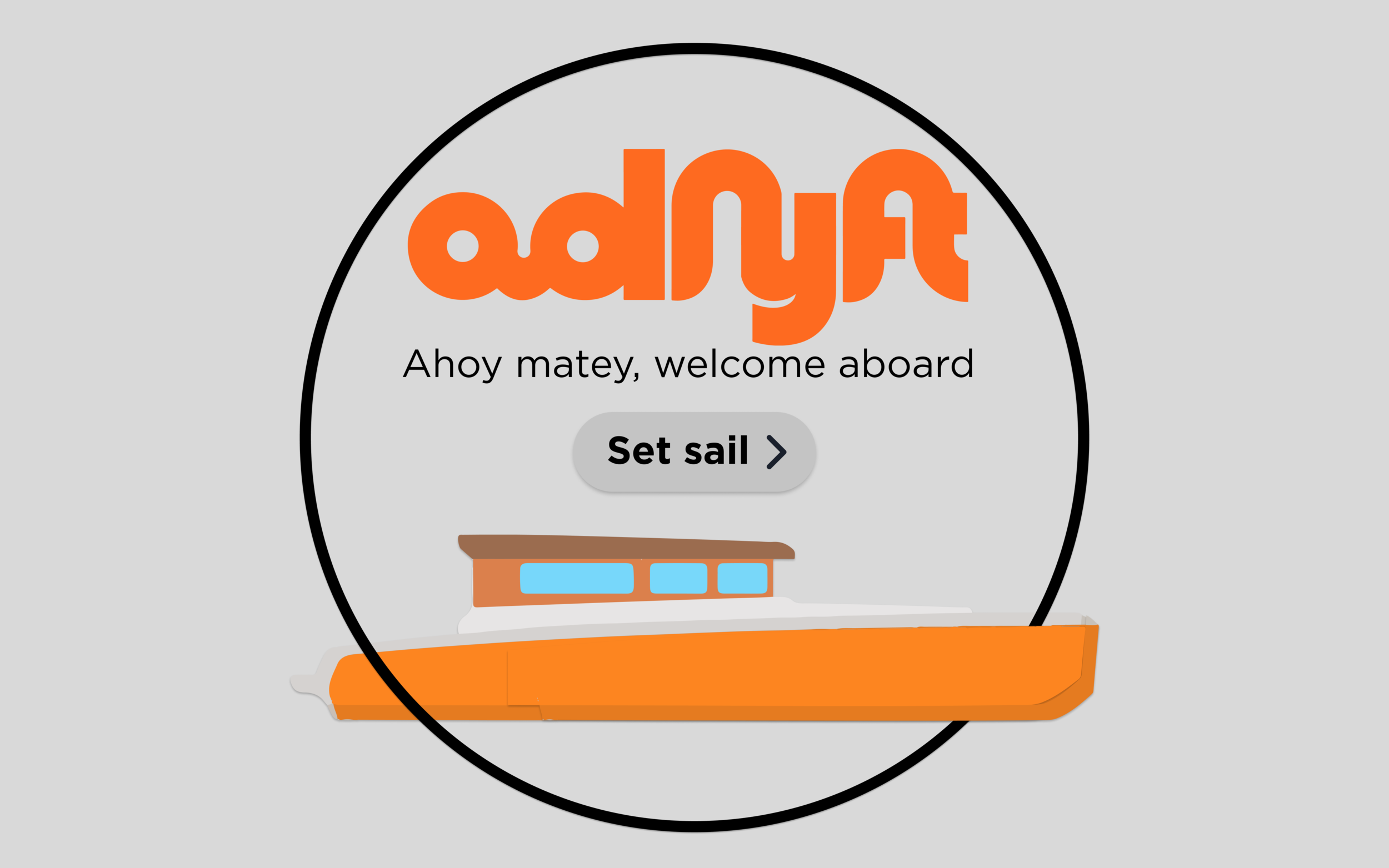
Welcome Screen.
This screen is on the infotainment display as the user enters the boat. To begin the voyage the user presses set sail.


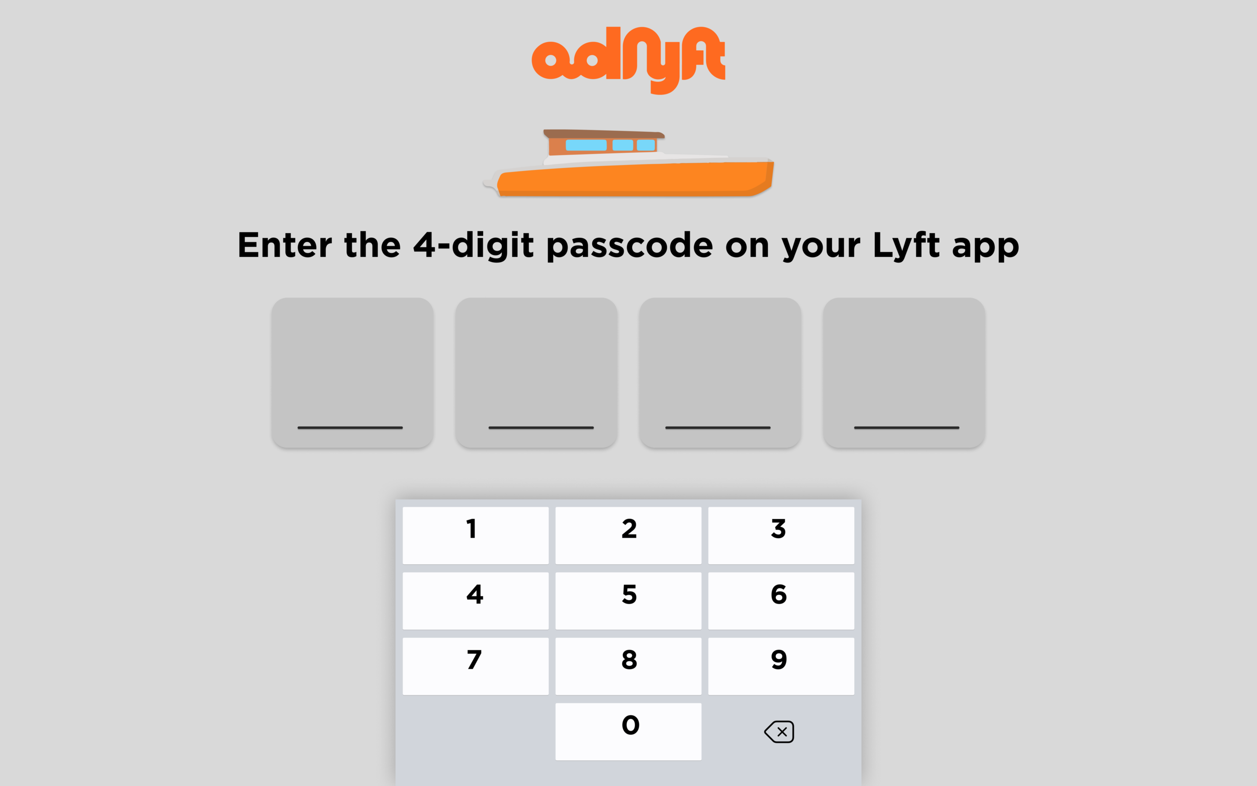
Verification Screen.
The user enters the 4-digit passcode that their Lyft app displays to ensure that the correct person is on the boat. Once the user enters their password, the display progresses to the next screen.


Confirmation Screen.
This screen allows the user one last chance to alter the stops of the trip before the boat begins moving. If users click edit trip, they see the screen on the bottom left where they can press and hold the stops to rearrange the stop orders. They can also add a stop which shows them the bottom right screen.

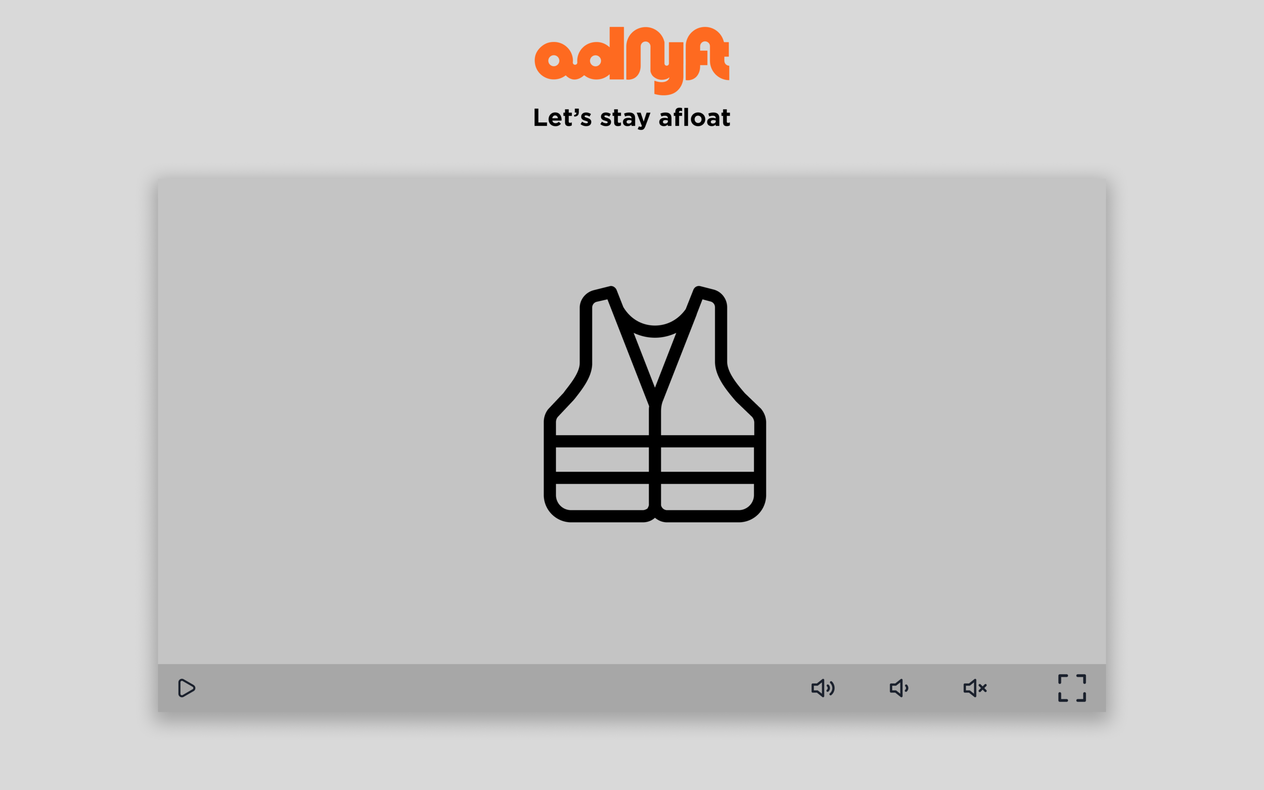
Instructional Video.
This video is a quick safety briefing to ensure that users know how to handle an emergency, where the buttons are for help, and where life jackets and fire extinguishers are on the boat.


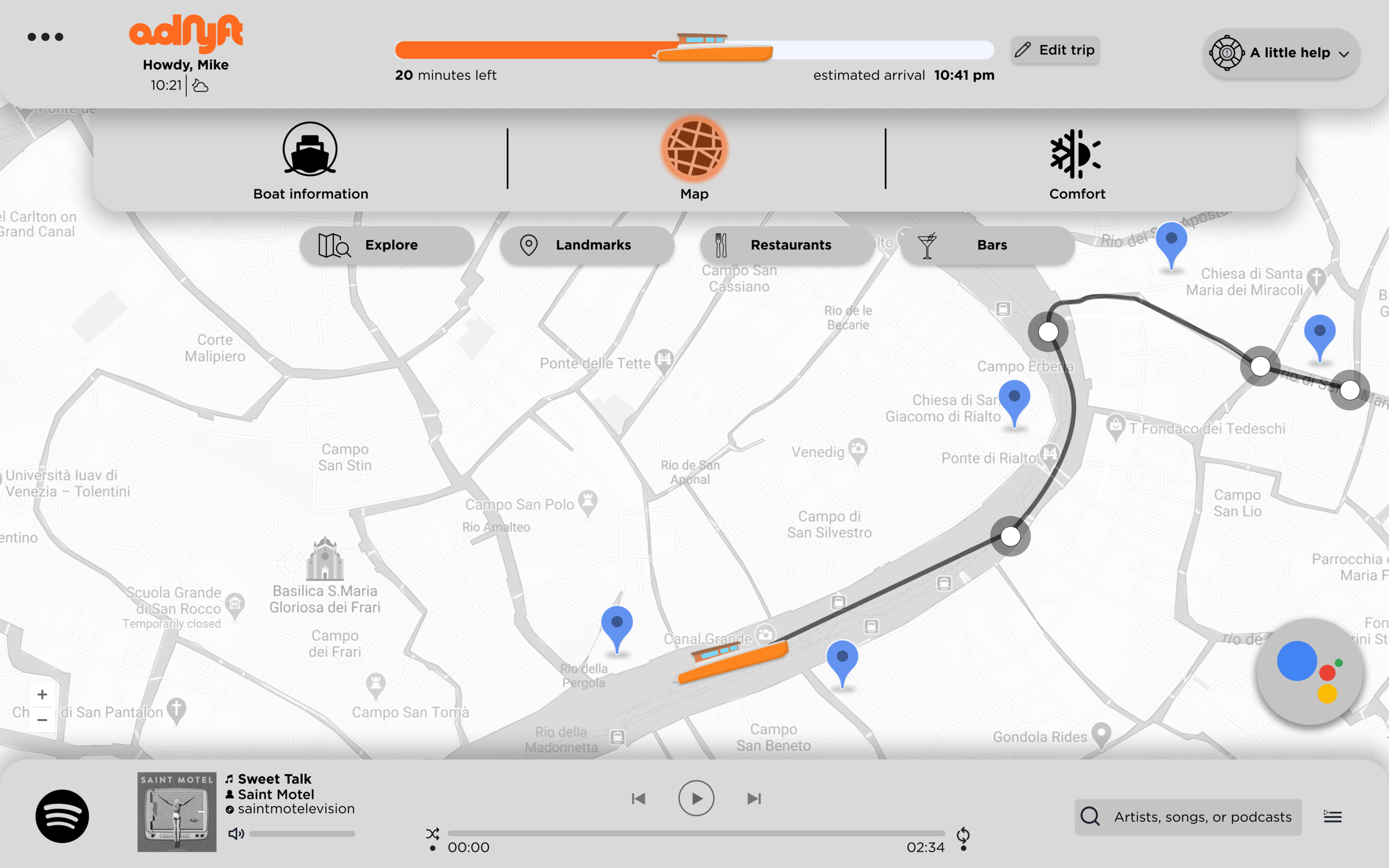
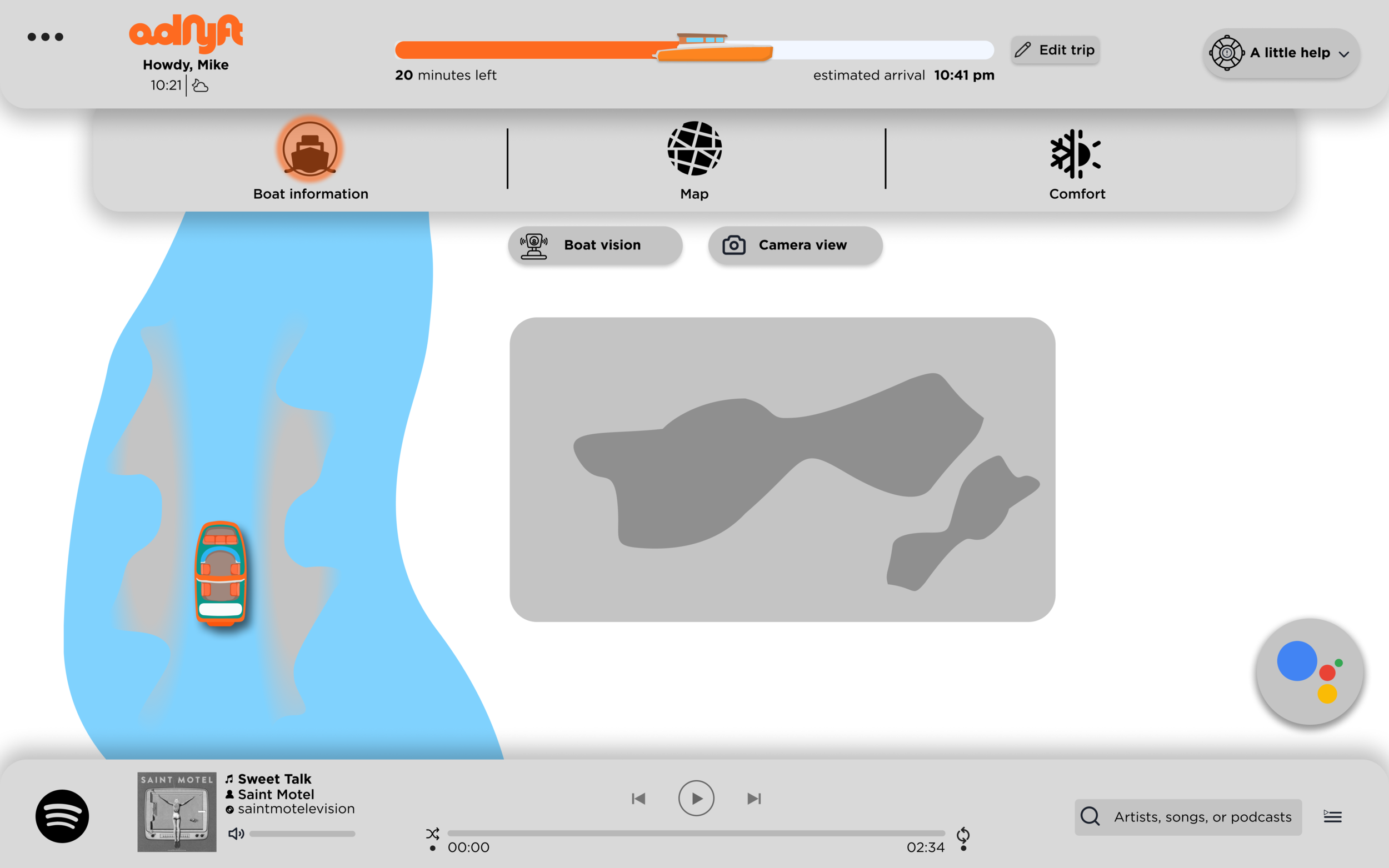
Home Screen.
This screen is the home and map screen. The two primary functions are the trip information at the top and the music at the bottom. It is from this page that users can see additional parts of the dashboard. The bottom screen shows what happens when a user taps on the trip progress bar which allows the user to rearrange the stop orders. If a user wants to add or remove a stop, then they will need to tap edit trip.

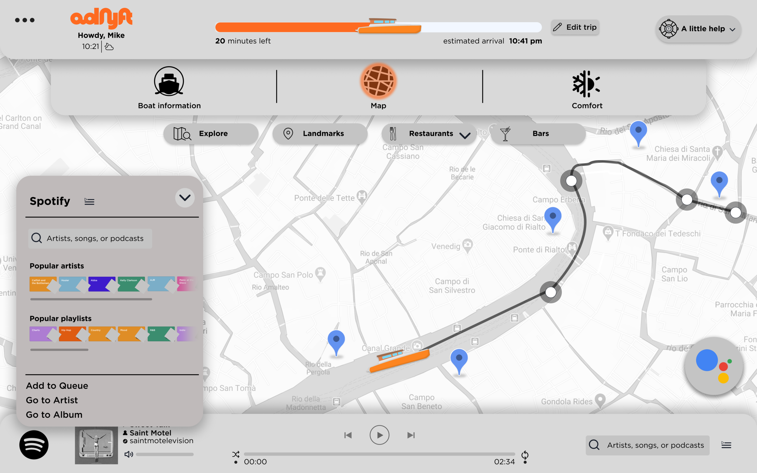
Home Screen – Music Controls.
This screen is pulled up from the bottom of the screen. Users can interact with the key functions of Spotify – the built-in music player. They can browse for songs or playlists, or they can manage the song queue.

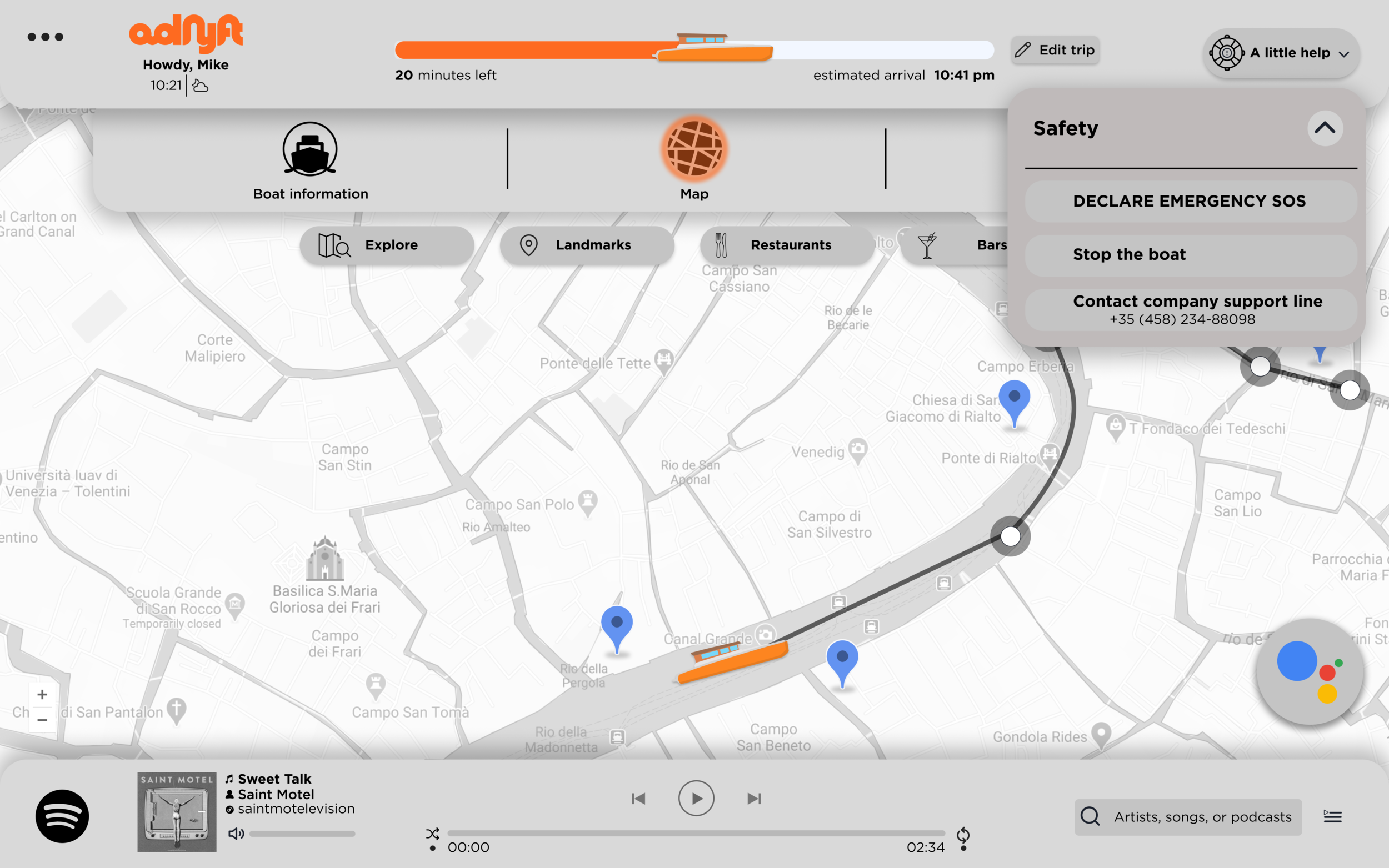
Home Screen – Emergency Button.
This screen is where users can get help. They can declare an emergency which will alert the local authorities, they can stop the boat, or they can contact the company support line.

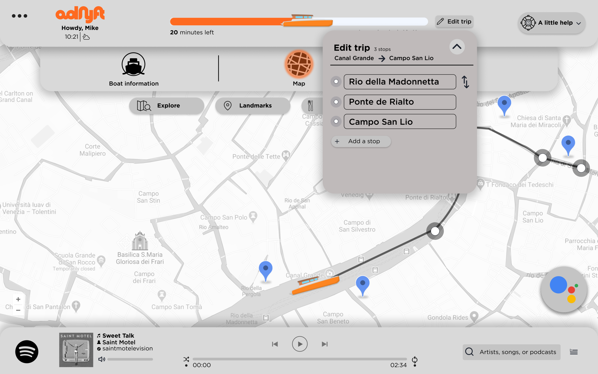
Home Screen – Edit Trip.
Users can edit the order of the stops here. They can tap and drag the stops to adjust the order, they can add new stops, or they can remove one of the stops that they already have added.

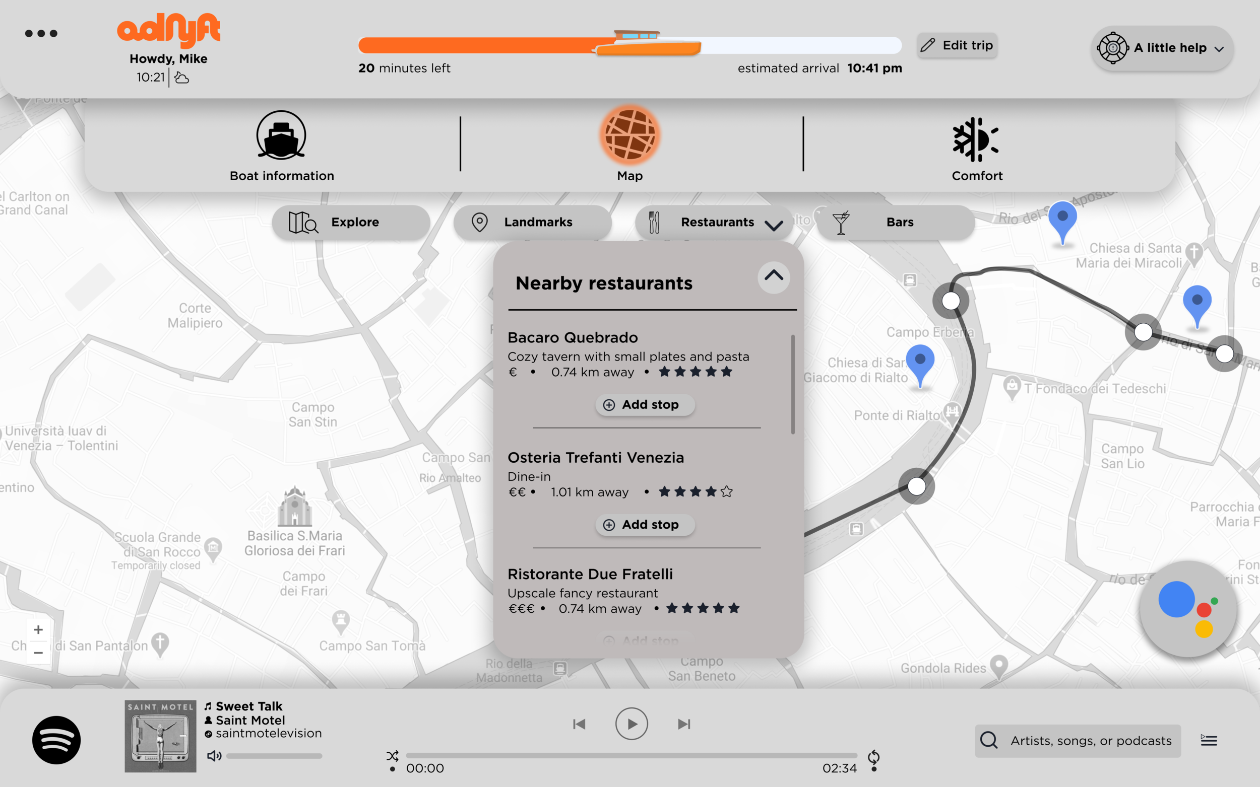
Home Screen – Explore.
This is an example of the parts of the map that are interactable. Users can tap one of the FAB buttons to get a list of local sights and add them to the trip if they would like.

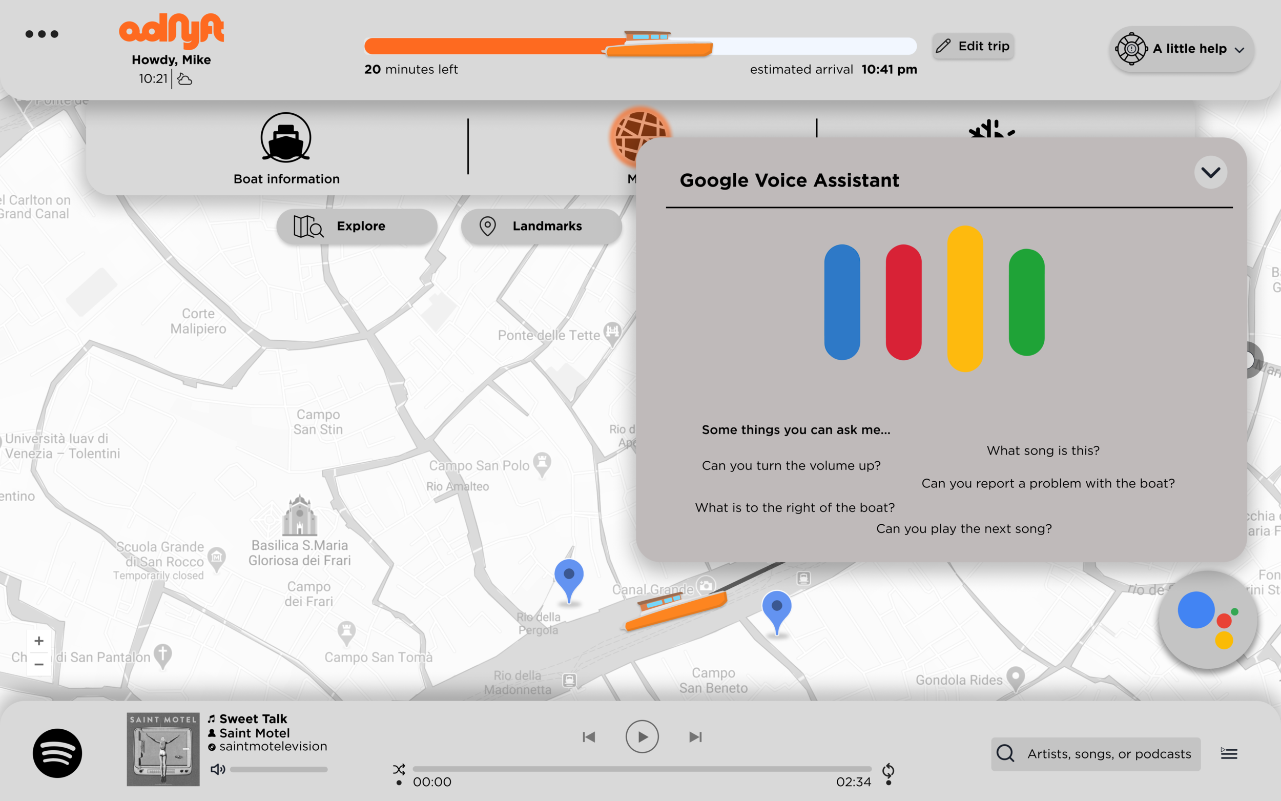
Home Screen – Google Voice Assistant.
Users can tap the Google Voice Assistant to interact with it and change parameters of the boat, adjust controls, or engage it to learn more about their surroundings.

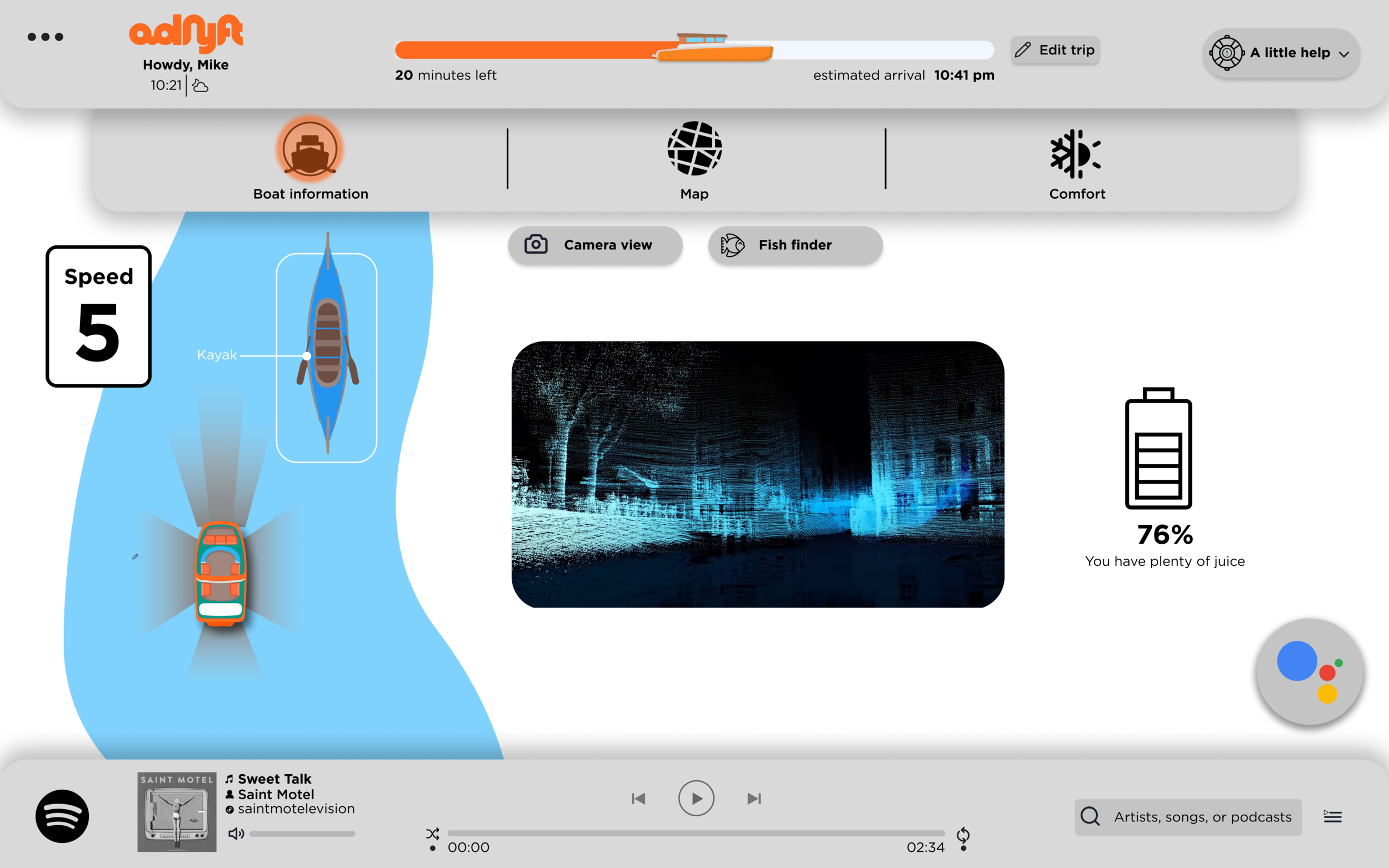
Boat Information – Obstacles.
This screen shows the user what the boat sees. There are clearly indicated obstacles on the canal. It helps users understand what the boat sees so that they feel more comfortable with an autonomous boat. The display shows the speed, the edges of the water, and any detected obstacles.

Boat Information – Lidar.
This screen shows the user a POV perspective of the Lidar system. There is a projected route, sensor data, and obstacles. This screen further helps create trust in the vehicle and its sensors.

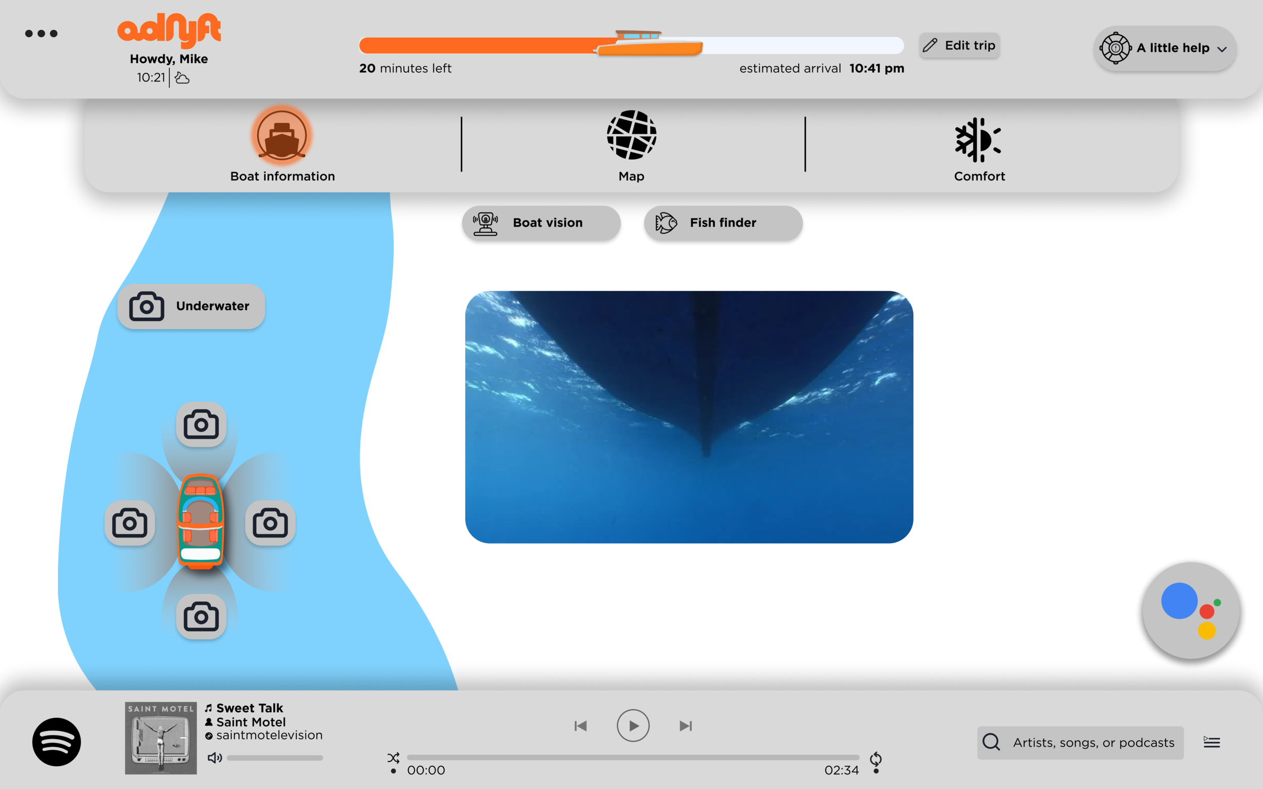
Boat Information – Cameras.
This screen shows the user an underwater live-video feed of the bottom of the boat. The user can tap and drag the video to change the direction of the camera.

Boat Information – Fish finder.
This screen shows the user a typical fish finder. The top part displays the fish at different depths and the bottom part shows the fish on the left and the right side of the boat.

Entertainment.
This screen allows users to search for media to watch on the boat. The users can choose from a variety of streaming platforms as well as games if the user pulls the card out further from the side.

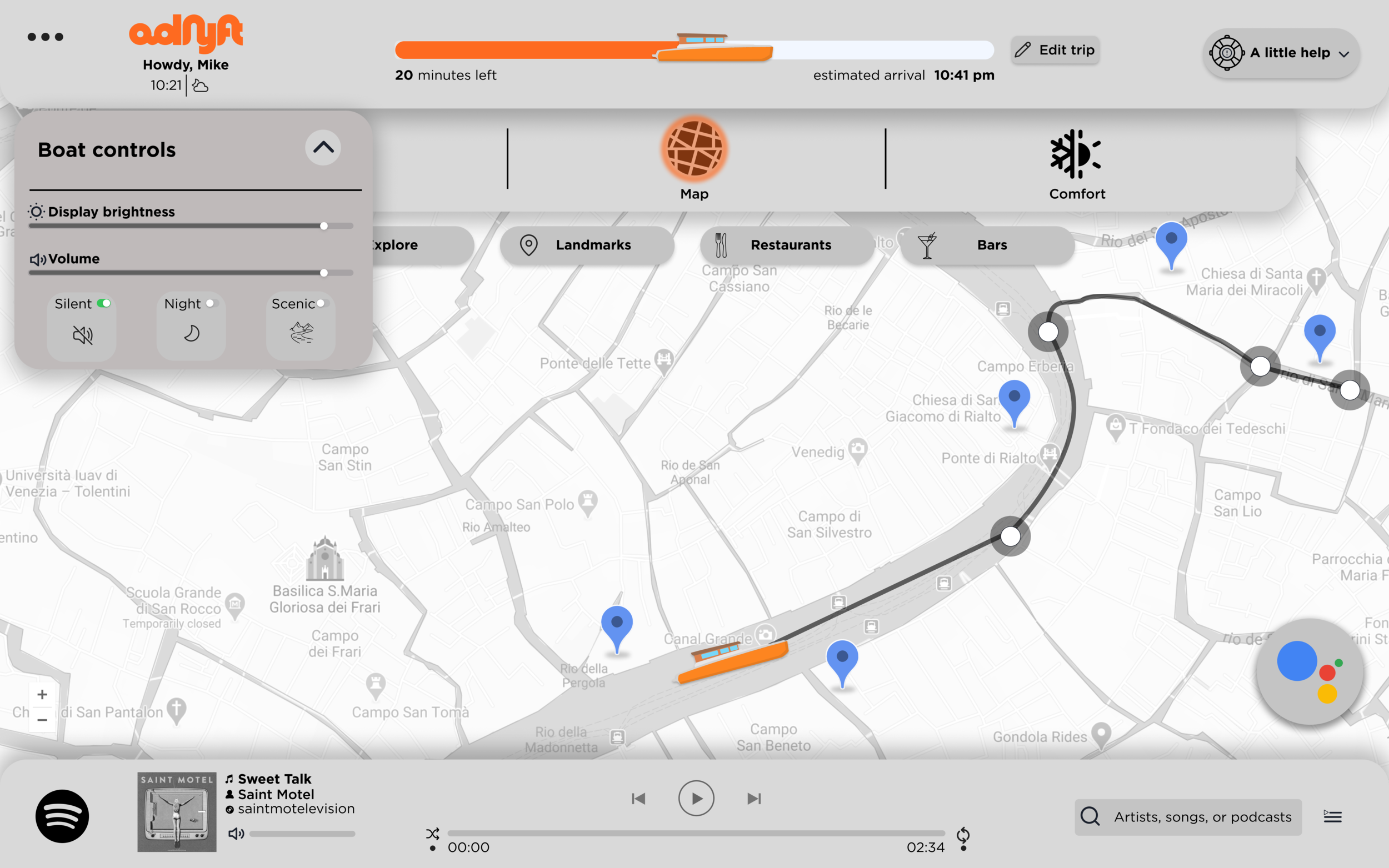
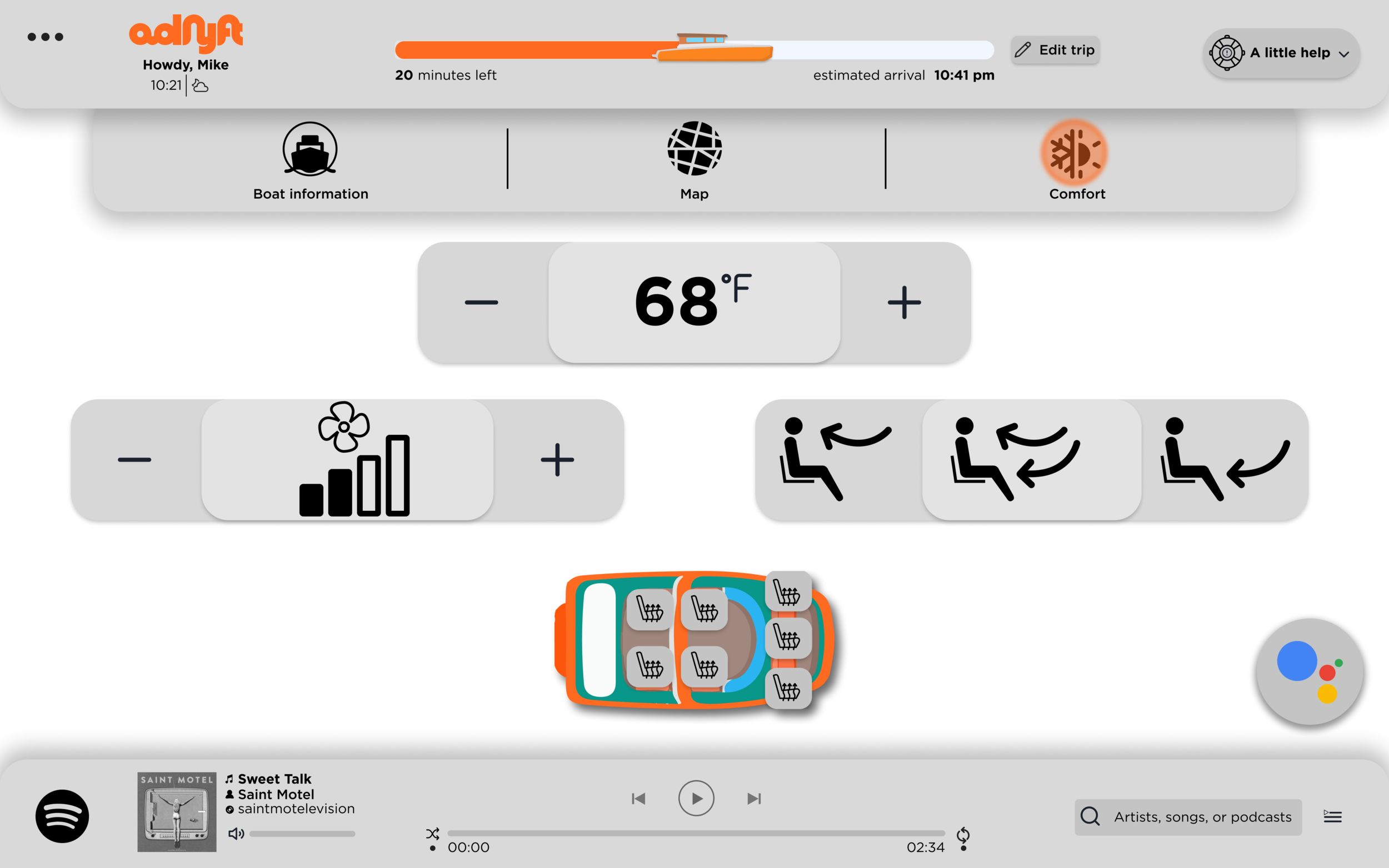
Comfort.
This screen allows users to change the temperature of the boat, the fan speed, the air direction, the seat heating, the display brightness as well as a few other ride adjustments such as silent mode, night mode, and scenic mode.